
Envision Math Grade 8 Volume 1 Student Edition Solutions Chapter 4 Investigate Bivariate Data Exercise 4.1
Page 211 Exercise 1 Answer
Based on the given data, we have to predict Luciana’s strategy.
The data regarding Luciana’s campaign is given.
From the data is observed that the maximum number of subscribers are gained when Luciana does around five to six social media posts in a day.
Thus, her strategy should simply be that she must do 5-6 social media posts every day. She should be careful and not do less than 5 social media posts on any day of the campaign in order to get the most number of subscribers.
Luciana’s strategy must be to do 5-6 social media posts each day in order to get most subscribers.
Envision Math Grade 8 Volume 1 Chapter 4 Exercise 4.1 Bivariate Data Solutions
Page 212 Exercise 2 Answer
Based on the given data, we have to tell the pattern between the time after posting and the number of new views.
The data regarding number of views on homepage is given.
From the data given, we can observe that when the time after posting the blog is more than 4 hours then the number of new views is decreased to two-digit numbers.
While when the time after posting is just 1-4 hours, then the new views are high and in three-digit numbers.
The pattern between the time after posting and the number of new views is than when time increases new views are decreased and when time is less, the number of new views is more.

Page 211 Exercise 1 Answer
Based on the given data, we have to tell the pattern between the time after posting and the number of new views.
The data regarding Luciana’s last social media campaign.
From the data given, we can observe that when she does around 1-4 social media posts in a day then she gets less number of new subscribers.
When she does 5-6 posts in a day, the highest numbers of subscribers are obtained.
But, when her posts are more than 6 in a day, again the number of subscribers decreases. This is the pattern observed from the data.
The pattern observed is that if there are 5-6 posts in a day new subscribers are increased, while if posts are less than 5 or more than 6 the number of subscribers are decreased.
Envision Math Grade 8 Volume 1 Student Edition Solutions Chapter 4 Investigate Bivariate Data Exercise 4.1 Page 212 Exercise 1 Answer
We are required to find the coordinates of the point that represents the data in the fourth column.
A two-dimensional plane which consists of two axis, one horizontal and the other vertical intersecting each other is known as a coordinate plane.
The horizontal axis is called as the x-axis, while the vertical axis is termed as the y-axis.
The intersecting point of both the axis is origin.
In the given data, age is in the x-coordinate while the number of entries is the y-coordinate.
In the fourth column, age is given as 13 years and the number of entries is 9.
Thus, the coordinate of that point will be (13,9).
The coordinates of the given point are (13,9).
Envision Math Exercise 4.1 Bivariate Data Detailed Answers
Page 213 Exercise 2 Answer
We have to describe the association between the two data sets.
Also we need to tell what the association suggests.
A scatter plot is a mathematical diagram which tells the relationship between paired data.
The scatter plot shows the relationship or association between the two sets of data.
There are three different types of association-
Positive association: The y-values increase as the x-values increase.
Negative association: The y-values decrease as the x-values increase.
No association: There is no consistent pattern between the x and y values.
From the graph given, we can observe that the association among the points scored and the minutes played is the positive associations.
This means that the y- values tend to increase when the x- values increase.
The association observed from the graph is positive association.
Envision Math Grade 8 Exercise 4.1 Investigate Bivariate Data
Envision Math Grade 8 Volume 1 Student Edition Solutions Chapter 4 Investigate Bivariate Data Exercise 4.1 Page 212 Exercise 1 Answer
We have to tell how the scale for both x and y axis will be chosen.
A two-dimensional plane which consists of two axis, one horizontal and the other vertical intersecting each other is known as a coordinate plane.
The horizontal axis is called as the x-axis, while the vertical axis is termed as the y-axis.
The intersecting point of both the axis is origin.
In the given data, age is given as 10,11,12,13,14,15 years.
There is just a single value increment among the two values.
Age is marked on x-axis, so the scale on x-axis will be starting from 0 and will be increased by 1 unit only up to 15.
The number of entries is given as 8,8,9,9,10,10.
There is just a single value increment among the two values.
The number of entries is marked on y-axis, so the scale on x-axis will be starting from 0 and will be increased by 1 unit only up to 10.
The scale on x-axis is from 0 to 15 with increment of one unit only.
The scale on y-axis is from 0 to 10 with increment of one unit only.
Page 214 Exercise 1 Answer
We have to tell that how scatter plot shows the relationship between paired data.
Two sets of data are said to be paired if there exists a one-to-one relationship among them.
The relationship among the paired data is represented by a method of drawing scatter plot.
Scatter plot is a mathematical diagram on which points or coordinated of the data are plotted.
The scatter plot is used to tell the relationship among paired data by identifying the association among them.
The scatter plot shows the relationship or association between the two sets of data.
There are three different types of association-
Positive association: The y-values increase as the x-values increase.
Negative association: The y-values decrease as the x-values increase.
No association: There is no consistent pattern between the x and y values.
The relationship between paired data is observed based on the type of association which exists.
Investigating Bivariate Data Grade 8 Exercise 4.1 Envision Math
Envision Math Grade 8 Volume 1 Student Edition Solutions Chapter 4 Investigate Bivariate Data Exercise 4.1 Page 214 Exercise 2 Answer
We have to tell what scale must be used to construct the given scatter plot.
A two-dimensional plane which consists of two axis, one horizontal and the other vertical intersecting each other is known as a coordinate plane.
The horizontal axis is called as the x-axis, while the vertical axis is termed as the y-axis.
The intersecting point of both the axis is origin.
On the x-axis, the hours of sleep will be marked. The scale will range from 0 to 9. This is because Marcy does not sleep more than 9 hours.
On the y-axis the points in the game will be marked. The scale for the same will be from 0 to 27 as the maximum points in a game is 27 only.
The scale on x-axis, will be from 0 to 9, on which the hours of sleep will be marked.
The scale on y-axis, will be from 0 to 27, on which the points in the game will be marked.
Envision Math Grade 8 Exercise 4.1 Solution Guide
Page 214 Exercise 3 Answer
We have to tell whether the statement given by Kylie is correct or not.
Kylie says that every scatter plot will have a cluster, gap and outlier.
We know that a scatter plot is a mathematical diagram.
The points on a scatter plot can be grouped or ungrouped. So, every scatter plot may not always be a cluster.
A gap on scatter plat is defined as the area where there are no data points.
This can only happen when the points are ungrouped and not always.
There may be an outlier in each scatter plot, but we can have a scatter plot which does not have a point away from rest all other points.
Thus, from all the above definitions, the statement made by Kylie is not correct.
Kylie says that every scatter plot will have a cluster, gap and outlier. This statement is wrong.
Envision Math Grade 8 Exercise 4.1 Practice Problems
Envision Math Grade 8 Volume 1 Student Edition Solutions Chapter 4 Investigate Bivariate Data Exercise 4.1 Page 214 Exercise 5 Answer
We have to tell why clusters and outliers must be present in the scatter plot.
Germaine constructs a scatter plot to show how many people visit different theme parks in a month.
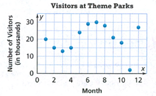
A group of points which are located closely around each other is called a cluster.
An outlier in each scatter plot, is the point which lies away from rest all other points.
In the given scatter plot, a cluster will obviously be present because we are aware that the people who tend to visit different theme parks for few months.
It is also possible that for some months, people do not want to visit a different theme park, so this will be an outlier in the graph.
In the given graph of scatter plot, clusters will be present because people may wish to visit different theme parks every month and outlier will be there are there are may be situation when they are not willing to visit a different theme park.
Envision Math Grade 8 Chapter 4 Exercise 4.1 Solutions
Page 215 Exercise 6 Answer
We have to complete the given scatter plot.
A scatter plot consists a coordinate plane which consists of two axis, one horizontal and the other vertical intersecting each other.
The horizontal axis is called as the x-axis, while the vertical axis is termed as the y-axis.
The intersecting point of both the axis is origin.
In order to complete the scatter, we have to tell what points will be marked on the x and y-axis.
On the x-axis, the racing time in minutes will be marked.
On the y-axis, the laps will be marked.
The completed scatter plot will be
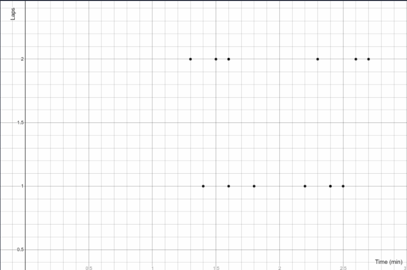
The scatter plot is completed as
Envision Math 8th Grade Exercise 4.1 Step-By-Step Bivariate Data Solutions
Envision Math Grade 8 Volume 1 Student Edition Solutions Chapter 4 Investigate Bivariate Data Exercise 4.1 Page 215 Exercise 8 Answer
We have to complete the scatter plot.
A Scatter plot is a mathematical diagram that represents the data.
We are given the data which shows the monthly attendance in thousands at museums in one country over a 12-month period.
The scatter plot will be completed on marking the data points as below:
The completed scatter plot is
The table shows the monthly attendance in thousands at museums in one country over a 12-month period.
We have to identify outliers in the scatter plot given
We are given the data which shows the monthly attendance in thousands at museums in one country over a 12-month period.
An outlier is a point, which is a single point away from all the other points plotted on the scatter plot.
On observing the scatter plot, the two outliers observed are the points (6,36) and (12,3).
The outliers identified are the points (6,36) and (12,3).
The table shows the monthly attendance in thousands at museums in one country over a 12-month period.
We have to identify the reason for existence of outlier.
We are given the data which shows the monthly attendance in thousands at museums in one country over a 12-month period.
An outlier is a point, which is a single point away from all the other points plotted on the scatter plot.
On observing the scatter plot, the two outliers observed are the points (6,36) and (12,3).
There was some discount on price of ticket to museum, which caused the first outlier which is (6,36).
In the month of December, some people do not visit museum because of holidays, so there is the second outlier (12,3).
The outliers are there because of discount on price and holidays in December.
How To Solve Exercise 4.1 Bivariate Data In Envision Math Grade 8
Page 216 Exercise 10 Answer
We have to check whether the given statements are true or not.
A scatter plot consists a coordinate plane which consists of two axis, one horizontal and the other vertical intersecting each other.
Ten athletes ran two races of the same length. The scatter plot shows their times.
The scatter plot is
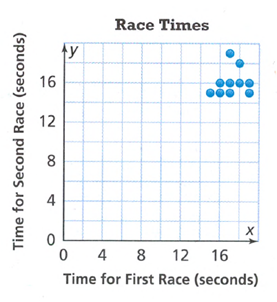
On observing the scatter plot graph, the true statements which are:
Eight of the times for the second race were less than 17 seconds.
There were three athletes who had the same time in both races.
Thus, the false statements are
Nine of the times for the first race were at least 16 seconds.
There were seven athletes who were faster in the second race than in the first.
There were three athletes whose times in the two races differed by exactly 1 second.
The true statements are
Eight of the times for the second race were less than 17 seconds.
There were three athletes who had the same time in both races.