
Carnegie Learning Algebra I Student Text Volume 1 3rd Edition Chapter 3 Linear Functions
Page 165 Problem 1 Answer
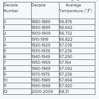
Given the table shown lists the average global temperature for each decade from 1880 to 2009.
We have to tell the data represent a function if yes then describe the function and if not then why not.
The temperature decreased from decade 0 to decade 1 and again from decade 6 to decade 8 so it cannot function.
Because the function is linear and exponential and they are increasing and decreasing by a rule.
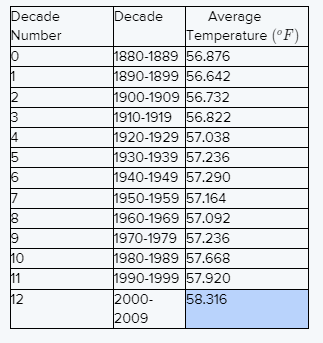
The function is increasing and decreasing for one portion with constant rates.
The best explanation for this data is decade 0 to 1, increases from decade 1 to decade 6, decreases from decade 6 to decade 8, and then increases from decade 8 to decade 12.
The data does not represent a function because the temperature decreased from decade 0 to decade 1 and again from decade 6 to decade 8 so it cannot be a function.
Page 165 Problem 2 Answer
Given the table shown lists the average global temperature for each decade from 1880 to 2009.
We have to represent the data using a graphing calculator.
In order to enter the data in our calculator, we must represent each decade as a single value.
Follow the steps provided to graph the relationship between time and temperature on a graphing calculator
Plot the point of the given data.
The lowest temperature is around 56 and the decade is 0 and the highest temperature is around 59 and the decade is 12.
then the graph represents the data is
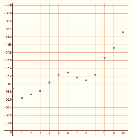
The graph represents the data is

Carnegie Learning Algebra I Chapter 3 Exercise 3.1 Solutions
Carnegie Learning Algebra I Student Text Volume 1 3rd Edition Chapter 3 Exercise 3.1 Linear Functions Page 165 Problem 3 Answer
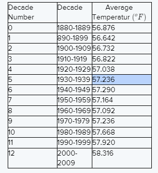
Given the table shown lists the average global temperature for each decade from 1880 to 2009.
We have to tell why do you think the first decade is numbered 0 Numbered 0 is the first decade makes it y-coordinateSince when the graph on the y-axis.
The numbered 0 is the point when graph intercepts the y-axis.
Page 166 Problem 4 Answer
Given the table shown lists the average global temperature for each decade from 1880 to 2009 .
We have to tell between which consecutive decades was there a decrease in average global temperature
The average global temperature decrease between the consecutive decades of decade 0 and decade 1, decade 6 and decade 7, and decade 8 and decade 9
The consecutive decades of decade 0 and decade 1, decade 6 and decade 7, and decade 8 and decade 9.
Page 166 Problem 5 Answer
Given the table shown lists the average global temperature for each decade from 1880 to 2009.
We have to write the range of the data set for a given table.The range is the difference between the biggest data value and the smallest data value.
From given table the biggest data value is 58.316 and the smallest data value is 56.642.
Then the range of the data set is 58.632−56.642=1.674.
The range of the data set is 1.674.
Carnegie Learning Algebra I Student Text Volume 1 3rd Edition Chapter 3 Exercise 3.1 Linear Functions Page 166 Problem 6 Answer
Given the table shown lists the average global temperature for each decade from 1880 to 2009.
Decade Number We have to answer it is possible to predict the approximate average global temperature for 2070-2079 using the graph and explain our reasoning.
No, it is not possible to predict the approximate average global temperature for 2070-2079.
Because the graph is both increasing and decreasing, we cannot use it to predict the approximate average global temperature.
No, it is not possible because the graph is both increasing and decreasing, we cannot use it to predict the approximate average global temperature.

Page 166 Problem 7 Answer
Given decade table about from average global temperature 1880 to 2009 .
We have to tell would it make sense to draw a smooth curve connecting the points in the plot if yes then why or not then why not.
No, it would not make sense to draw a smooth curve connecting the points in the plot.
Because the data does not represent one function.
No, it would not make sense to draw a smooth curve connecting the points because the data does not represent one function.
Page 167 Problem 8 Answer
Given the table shown lists the average global temperature for each decade from 1880 to 2009.
We have to determine the linear regression equation for the average global temperature data.
As per the given values in the question,
we get a=0.1101758242 and b=56.57217582 then linear regression equation isy=0.1101758242x+56.57217582.
The linear regression equation isy=0.1101758242x+56.57217582.
Linear Functions Chapter 3 Exercise 3.1 Answers
Carnegie Learning Algebra I Student Text Volume 1 3rd Edition Chapter 3 Exercise 3.1 Linear Functions Page 168 Problem 9 Answer
Given the table shown lists the average global temperature for each decade from 1880 to 2009.
We have to rewrite the linear regression equation as a function.
This time, round the slope and y-intercept to the appropriate place and explain our reasoning.
Values rounded to 3 decimal place.
The temperature in a given table is rounded to 3 decimal places.
So the slope and y-intercept are also rounded to 3 decimal places.
The linear regression equation is y=0.110758242x+56.57217582 then the function is f(x)=0.110x+56.572.
The rounded linear regression equation isf(x)=0.110x+56.572.
Page 168 Problem 10 Answer
Given sketch the data points and the line of the best fit we see on the calculator.
We have to answer the data show a positive correlation or a negative correlation and how can we tell.
The slope of the graph of linear regression is positiveSo the data show a positive correlation.
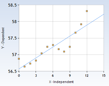
The data show a positive correlation because the slope of the graph of linear regression is positive.
Page 168 Problem 11 Answer
Given sketch the data points and the line of the best fit we see on the calculator.
Use a graphing calculator to plot the data point and line of best fit by following the given steps in book.
Yes, this line fits the data well.

Because most of the points are closer to the line.
Yes, most of the points are closer to the line so this line fits the data well.
Carnegie Learning Algebra I Student Text Volume 1 3rd Edition Chapter 3 Exercise 3.1 Linear Functions Page 169 Problem 12 Answer
Here we have to find what is the correlation coefficient, or r-value, for your line of best fit and Interpret the meaning of the r-value.
Follow the given steps in the textbook to find the linear regression equations and also findr≈0.889.
r is positive then the data has a positive correlation coefficient.It is close to 1 then the line of best fit the data.
The value of r is ≈0.889 therefore the data has a positive correlation coefficient and the line of best fit the data.
Page 169 Problem 13 Answer
Given from previews question your graph showing the average global temperature from 1880 to 2009.
We have to Xmin and Xmax, and Ymin and Ymax for this graph and tell how he look like.

To change Xmin and Xmax add more data than 0 through 12 such as 0 through 18, and Ymin and Ymax add more data than 56 through 59 such as 0 through 60.
Use the steps given in your textbook to graph the data.
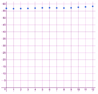
To changing the Xmin and Xmax add more data than 0 through 12 such as 0 through 18, it makes the graph steeper
To changing the the Ymin and Ymax add more data than 56 through 59 such as 0 through 60, it makes the graph like a horizontal line
Changing the Xmin and Xmax add more data than 0 through 12 such as 0 through 18, it makes the graph steeper and changing the Y min and Ymax add more data than 56 through 59 such as 0 through 60, it makes the graph like a horizontal line

Page 170 Problem 14 Answer
Given linear regression equationf(x)=0.110x+56.572
where x represent the decade number and f(x) represent the average temperature.
We have to write an appropriate unit of measure and describe the contextual meaning.
Then, choose a term from the word box to describe the mathematical meaning of each part.
Here f(x) represented the average temperature.
Therefore, the units for f(x) are ∘F, the contextual meaning is the average temperature in ∘F, and the mathematical meaning is the output value x represent the decade number x is the independent variable so it is the input value.
Its contextual meaning was the time in decades so its units are decades.
The value of 0.11 is the slope of the linear function so its mathematical meaning is the rate of change.
Since 0.11 has units of ∘F per decade and its contextual meaning is the temperature increases 0.11∘F per decade And 56.572 is the y-intercept of the linear function.
Since it has units of ∘F.
Its contextual meaning is the initial temperature was 56.572∘F in decade 0.
Now we can fill table as
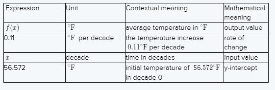
The table after filling is:

Page 170 Problem 15 Answer
Given linear regression equation f(x)=0.110x+56.572 where x represent the decade number and represent the average temperature.
We have to find how much was the average global temperature changing each decade from 1880 to 2009 according to the data and explain how we know.
The slope of the equation represents the rate of change.
Then the slope of the linear regression equation is0.11 represents the temperature is increasing by about 0.11oF per decade from 1880 to 2009.
The temperature is increasing by about0.11oF per decade from 1880 to 2009 because it is the slope of the linear regression equation.
Carnegie Learning Algebra I Linear Functions Exercise 3.1 Solutions
Carnegie Learning Algebra I Student Text Volume 1 3rd Edition Chapter 3 Exercise 3.1 Linear FunctionsPage 171 Problem 16 Answer
Here we have to compare the y-intercept from the table with the y-intercept from the linear regression equation and tell what do we notice.
Does this make sense in terms of the problem situation if yes then why and if no then why not.
The y-intercept from the table is 56.876 and the y-intercept from the linear regression equation is 56.572 we notice the linear regression equation is smaller than the y-intercept from the table.
Because the temperature decreased from 0 to 1 and then increasing so this make sense of the problem situation Since the linear regression equation is molding the general trend of the data values increasing not given the exact values.
The linear regression equation is smaller than the y-intercept from the table.
It does this make sense in terms of the problem situation Since the linear regression equation is molding the general trend of the data values increasing not given the exact values.
Page 171 Problem 17 Answer
Given linear regression equation f(x)=0.112x+56.572
Here we have to use your equation to predict the average global temperature for the years 2070-2079 and show your work and explain your reasoning.
Find the difference between 1880 and 2070 years.
The difference between 1880 and 2070 years is 2070−1880=190
So the 19 decades after 1880-1890.
Substitute x=19 in the linear regression equation to predict the average global temperature for the years 2070-2079
f(x)=0.112x+56.572
f(x)=0.112(19)+56.572
=2.09+56.572
=58.662
Hence, the average global temperature for the years 2070-2079 is 58.662oF.
The average global temperature for the years 2070-2079 is58.662oF.
Exercise 3.1 Linear Functions Explained
Page 171 Problem 18 Answer
Given linear regression equation f(x)=0.112x+56.572
We have to predict the first decade with an average global temperature of at least60oF.Solve the inequality f(x)≥60 for at least 60oF.
Linear regression equation f(x)=0.11x+56.572
For at least 60oF solve inequalityf(x)≥60
for at least60oF temperature.
0.11x+56.572≥60
0,11x≥3.428
x≥31
31 decade means 310 years Since this predict the average global temperature for1880+310=2190
Hence, for 2190−2200.
Predict is 2190−2200 an average global temperature of at least 60o F.